Tuesday 16 March 2010

Wednesday 10 March 2010

Milgrim, own section

Demon Headmaster

People cool with it? Think you can tell who it is? I think I might put names on all the drawings in the bottom corner, do you think it's needed?

Tuesday 9 March 2010

Monday 8 March 2010

Colour

Front Cover


These are just initial experimentations,gonna do lots more.
I know we want something more precise than 'Fads and the Nineties' but I couldn't think of anything so I've just put it in as a placeholder.
I realise some of the text looks too faint, working on it, maybe a darker background.


Foil block

What do people think about the idea of black foil? I think it could look really cool on like a grey/off white cover?

Haven't been able to find many good examples online


Sunday 7 March 2010


Taster


Jonathan Fleetwood. Age 17. Been out the game for 18 months, making his return.

Thursday 4 March 2010

Font

http://rapidshare.com/files/358780816/router.zip.html

Just so everyone can have it...

Wednesday 3 March 2010

Update / Photo success

Hey guys,

Sorry for the confusion today, don't think me or Jed got round to organising anything properly! Tomorrow, we're going to try and photograph the non verbal, physical fads. "Durrr' 'Suck it!" etc etc. We found a cool playground that is in a decent estate down the road towards Battersea, could shoot it there, OR there's an amazing outdoor playground/adventure thing with a trampoline and stuff in Pimlico. It's run by the council though and only has certain opening times, we thought they might be a bit funny about us taking photos in there too. Got the number though and will try ring later to see what it's like. Bought to plain white shirts in Primark today and I think Ali and Dan are down for modelling and playing about.

I've been editing the photos today and they look really good! Will attach a few more below so you can see how they look alongside the text roughly. Obviously the layout isn't going to be like this for everything

Commented in Emma's post but just to say it here again, we might have to consider having the publication as one book rather than three. Mainly because of the way the essay is structured, could just be a leaflet for the first section which will look pretty stupid! This could be good though, will be cheaper and could potentially mean we could look into getting the covers screen printed / UV glossed with the printing! Nothing definite though. And if we do end up with one book would make sure the three sections within are obvious, maybe some endpaper to mark out sections?


Tuesday 2 March 2010

More mock up ideas.

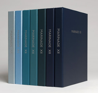
I very much like dan's layout and love the font for the cover mock-up. Below I've included a really nice gradient set, with colours similar to those we were interested in. Also will the cover only be typographic? Or image also? I think it could be nice to have an image of the gay card, but then is this too much "gay" stuff for one cover? I think screen printing will allow us the most interesting cover.


Layout idea

Opinions?